0
numbers fabricated — the browser structurally cannot mint one
For anyone who has to stand behind an AI's numbers.
Ask your business data anything in plain English. Columnly returns dashboards and briefs where every number is verified, you can click any number to see exactly where it came from, and it refuses to invent one it can't prove — in the web app, or right inside Google Sheets.
"What was our won revenue last quarter, and how did it move?"
Teal underline = proven · amber dashed = honestly flagged
Built for the person who has to defend the number. RevOps, finance, and founders who walk into pipeline and board reviews and get asked "where did this come from?" — and need an answer they can prove. No SQL, no data team.
Ask it something the data can't support and it won't guess — it declines, shows you exactly why, and points to what it can prove. Try both questions:
This is the whole philosophy in one interaction: it would rather tell you the truth than tell you a number.
It reads your data — the dimensions, the slices, whether there's a date axis or a geography or a real sequence of stages — and works out which of seventeen distinct layouts (7 for briefs, 10 for dashboards) actually fits. Then it shows you the options, recommends one with a reason, shows the ones it ruled out and why, and lets you overrule any of it.
The request: "Create a monthly performance report"
They differ in where things go and how much a reader has to hold in their head — not in styling. Pick by looking. Try a different dataset above and watch the fit set change.
Pick one and I'll build it. You can change shape afterwards — the analysis doesn't get rebuilt, only laid out again.
Say the word and I'll build any of these anyway — the reasons are here so you can disagree with them.
The plates show where things go, not how they will look. Every shape uses the same palette, the same type and the same traceable figures — a number is one click from its source in all of them. What changes is the order a reader meets things in, and how much they have to hold in their head at once.
The same picker chooses among ten board forms — each offered only when your data fits it. Nine of the ten slice live; the monitoring wall doesn't (it's read across a room with nobody at a keyboard), and no brief slices — a slicer would rewrite numbers underneath prose already written.
This is the whole product in one gesture. Every figure below is live — click any of them for its Source → Computation → Reconciliation. Then filter the board and watch every figure recompute and re-verify.
On a real board this popup is anchored to the number itself — because the tie to that figure is the point.
The same verification engine, two products. Pick the one that fits how you work — or use both.
Sign up, connect HubSpot or Pipedrive or upload your files, and ask. You get verified dashboards and briefs that stay live, re-sliceable, and refreshed daily — with a real multi-seat workspace behind them.
An AI analyst that lives in the Sheets sidebar. Ask in plain English; it cleans, computes, writes real formulas, and ships hosted analyst briefs and dashboards — without ever editing your original sheet.
| Web App | Google Sheets | |
|---|---|---|
| Your data | CRM + uploads, persisted & refreshed daily | Your open sheet, read live — nothing at rest |
| Connectors | HubSpot + Pipedrive (read-only) | — |
| Stays live | Autopilot on a schedule | Re-run any time |
| Best for | Teams monitoring live business data | Anyone who already works in Sheets |
Two ways in, from one "Add source" entry. Connectors are read-only, forever — so Columnly can never write back to your CRM.
🔒 Read-only, forever — enforced by a positive scope allowlist at the provider edgeDiscovers contacts, companies, deals, tickets, line items, products, custom objects, owners and pipeline stages — plus the real associations between them.
Deals, Persons, Organizations, Activities, Products and Leads with full custom-field support — plus the deal/person/org links.
Drag-drop a workbook. Each honest worksheet becomes a source; pivots and legend tabs are skipped, not mis-imported. Dirty columns are kept verbatim, never silently coerced.
First sync is a full pull; after that only what changed. A daily refresh runs at 6 AM in your workspace's own timezone — and a broken pipeline surfaces loudly in amber, never as silent stale data.
Columnly never auto-cleans behind your back. It names what's wrong, quotes your own value back as a yes/no, and only applies a cleaning it can verify — then freezes it as a replayable recipe.
HubSpot and Pipedrive both have "deals" and "products." Columnly namespaces them so both live in one workspace cleanly.
It detects the mess, quotes your own values back as a yes/no, and shows every fix in a diff you can undo — before it computes a single number.
| Order ID | Name | Date | Revenue |
|---|---|---|---|
| #1041 | acme corp | 3/14/24 | 12,400 |
| #1042 | TECHFLOW | 14-3-2024 | 28900 |
| #1043 | meridian ltd | March 15, 24 | Varies |
| #1044 | apex | 15/03/2024 | 31,200 |
Your data's already clean and verified here — why export it to a chatbot that'll guess at the numbers?
Every data question is solved twice, by two different-class models. One decomposes and computes it; an independent second re-derives the whole thing from scratch — it never sees the first one's work. The answer ships only when the two agree within a strict tolerance. A genuine second opinion, not a rubber stamp.
Before computing, it decides which of your sources are actually relevant to this question, picks the one that anchors the answer, and states a reason for anything it leaves out.
If a source shares no join key, its rows aren't counted — and the answer says so: "answering from X + Y; Z holds no rows relevant to this." The classic partial-total bug, fixed.
Even a conversational reply can't state a number that isn't in your data. Numbers in the text are machine-matched to computed results; an unmatched number falls back to the verified value.
Want the full picture of why you can trust the numbers — the results store, server-owned figures, and deterministic verification?
Read how it works →Not a feature race — a different standard. Every one of these is live in Columnly today, and we haven't seen any other AI data tool do them.
No other AI shows you the shapes it could build — as structural thumbnails — recommends one with a reason, and shows what it ruled out. You pick by looking.
No other AI verifies each published number against an independent computation and lets you click any figure to see its Source → Computation → Reconciliation.
No other AI ships dashboards and analyst briefs as rich and interactive as ours — 17 forms, re-sliceable in place, every figure one tap from its origin.
No other AI keeps a published dashboard current on a schedule at near-zero cost — everywhere else, a refresh rebuilds the whole artifact from scratch every time.
No other AI runs a multi-layer cleaning pass, restructures your data, and writes real recalculating formulas — each verified — before it ever states a number.
No other AI is both native inside Google Sheets and a standalone web app on your live CRM — the very same verification engine running in both places.
Put a finalized analysis on Autopilot and it re-runs on your schedule against fresh data, no human in the loop. Every run has three honest outcomes:
It never advances a published analysis on a failed run. That discipline is structural, not a setting.
On Autopilot, dashboards refresh for near-zero credits — everywhere else a refresh rebuilds the whole artifact at full cost.
No prior period → no "% change." No target column → no "vs target." When an insight can't be backed, it's dropped from the artifact and you get a real choice — proceed without it, don't build, or pick a re-verified alternative.
"You asked for best menu items and location-wise performance — this dataset has no product field and no geography, so those aren't shown."
A real, number-free UI card — shown only when the gap is real.
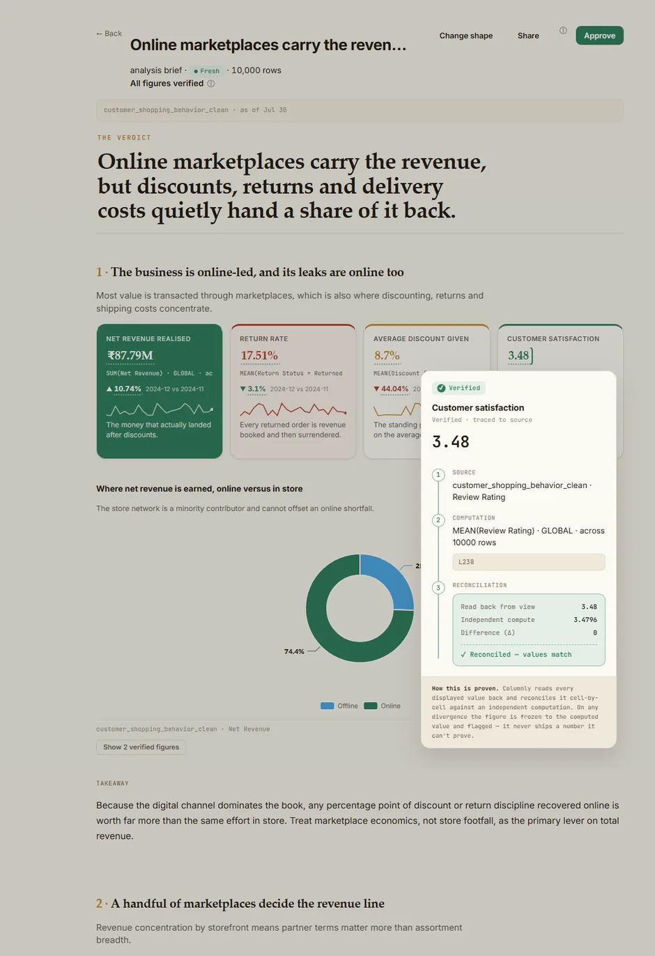
Because the reader's job differs, the output does too. A dashboard is a dense console you monitor. A brief is a single reading column you read once — thesis, evidence, tension, recommendation.
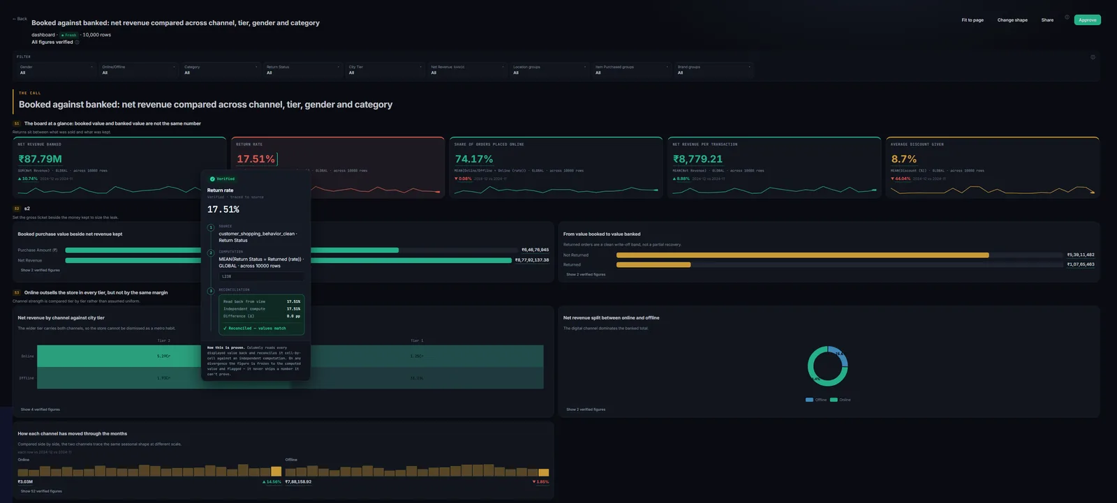
Dashboard — an instrument you monitor. A real board over 10,000 rows, all figures verified — here with one figure's Source → Computation → Reconciliation open.
The same verification engine, in a warm editorial register — thesis, evidence, tension, recommendation, read top to bottom. Every figure is still one tap from its source; the identity changes, the guarantee never does.
These are real Columnly outputs — the click-to-trace popup is open in each.
Set the company's identity once, and every dashboard and brief anyone builds comes out in your colours and logo. Choose a palette and a register for each kind — briefs default to light (they're read and printed), dashboards to dark (they're watched for hours).
You supply exactly two colours. Grounds, meaning colours and series hues are derived from them — and a live guard steps in the instant your brand would collide with what a colour means. Drag either swatch:
Resolved values export as copyable hex — paste these into Office, Slides or Figma, so your Columnly palette travels into the deck you build afterwards.
Top-left is the wrong corner for a dashboard even though it's the web convention: readers scan a board in a Z from top-left, and a logo parked on that route costs them the headline metric.
Existing artifacts keep their look until rebuilt. Changing your branding never silently rewrites work you've already published and approved.
An owner splits one org credit pool into per-member budgets — power users get more, occasional users get less — set once a year. Roles decide who can build, finalize, and manage connectors.
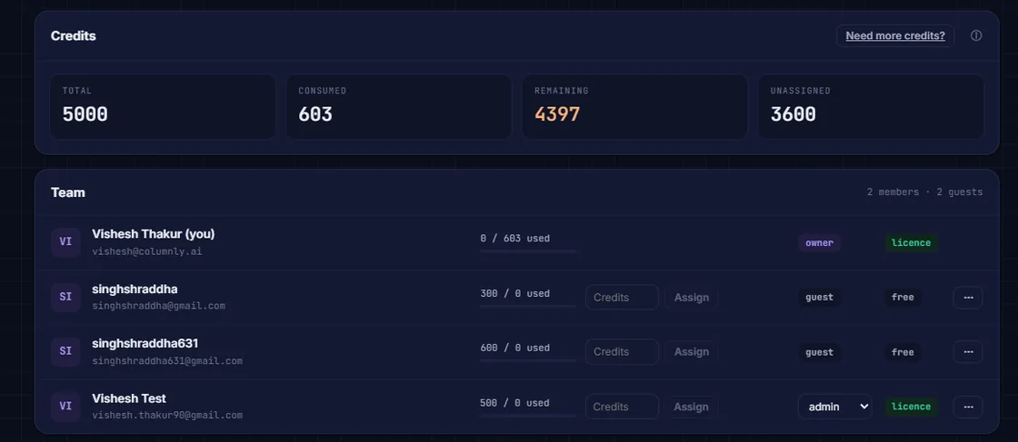
Share a live dashboard or brief with any number of colleagues as free view-only viewers — and every viewer can click any number and watch it reconcile. Only builders pay.
Owner / Admin / Member, enforced server-side. Removing a member returns their credits to the pool — and credits run annually, not monthly, so there's no monthly surprise.
A real workspace's members panel — the org credit pool split into per-member budgets, set once a year.
Start free. Analyst adds the full Sheets analyst; Explorer unlocks the web app with your CRM connected.
Get an analyst that proves every figure and refuses to guess — on your CRM, your uploads, or your Google Sheet.